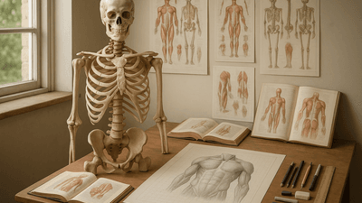
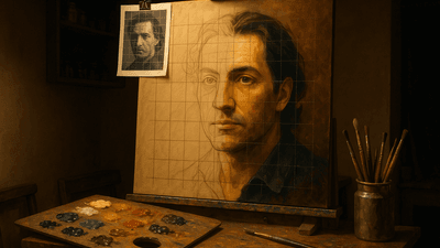
Mastering Anatomy with the Grid Method: A Step-by-Step Guide
[object Object]
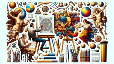
Explore drawing techniques, painting methods, and artistic insights gathered from years of practice. Each article shares practical knowledge to help you master the grid method and improve your art.
[object Object]
[object Object]
[object Object]
[object Object]
[object Object]
[object Object]