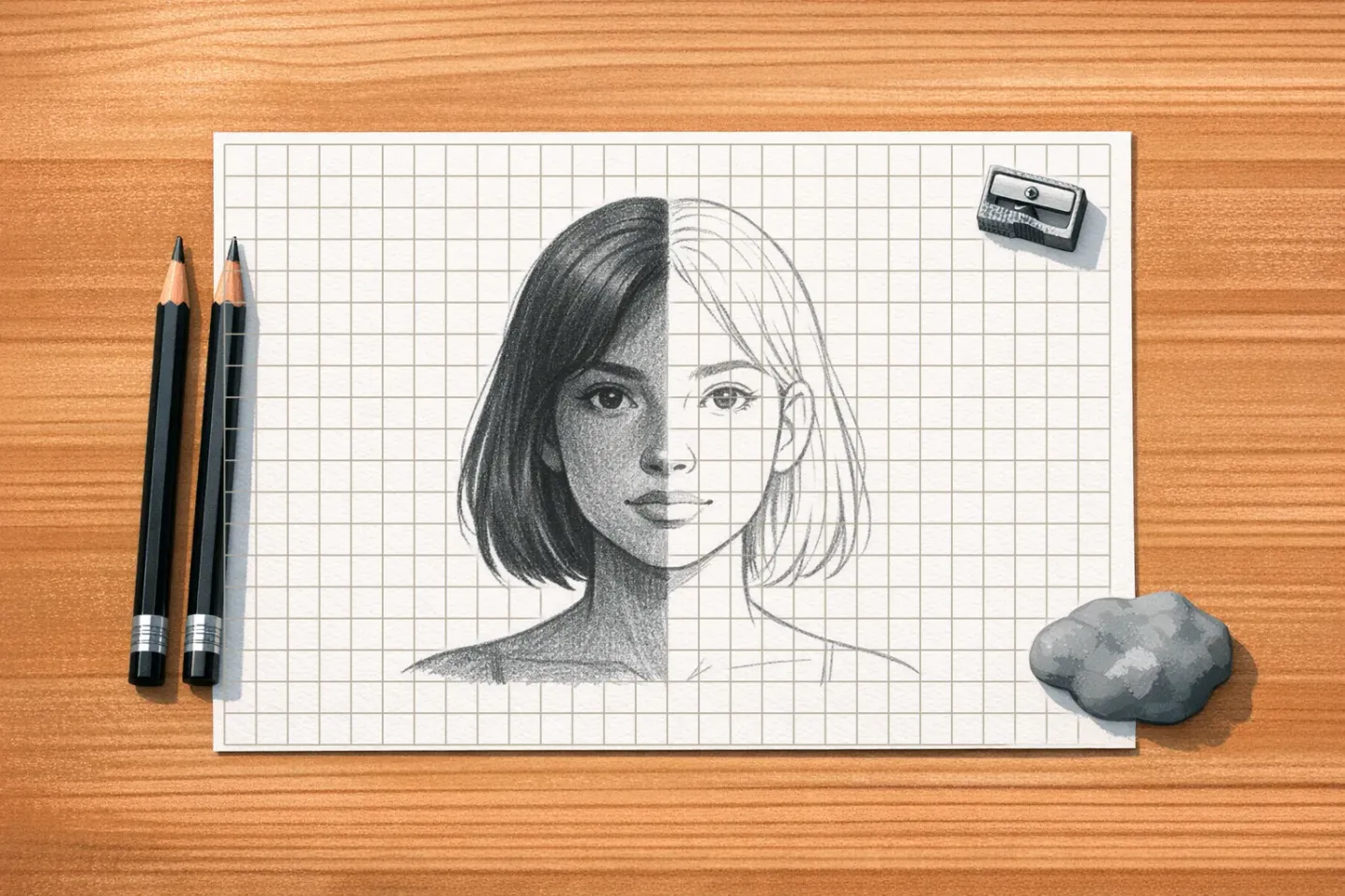

Most failed portraits are not failures of shading. They are failures of placement: an eye two millimetres too high, a mouth a fraction too wide, a nose that sits a hair off the centreline. The face still looks like a face — just not like that face. A grid fixes exactly this problem, because it turns "does this look right?" into "is this shape in the same cell as it is on the reference?"
The reason it works has nothing to do with cheating. When you look at a face as a face, your brain hands you a symbol: two eyes, a nose, a mouth. That symbol quietly overrides what is actually in front of you. That is why beginners draw eyes too large and place them too high on the skull: the symbol is more memorable than the measurement. Splitting the reference into cells interrupts that shortcut. Inside one 2-centimetre square there is no "eye", only a dark curved shape that starts a third of the way down the left edge. You draw shapes, and the likeness assembles itself.
If you have never gridded a drawing before, the basics of grid drawing for beginners covers the mechanics of scaling and transfer. This article assumes you know how to draw a grid and focuses on what portraits specifically need from it.
Grid Setup for Portrait Drawing
One density, not a formula
Every grid question for a portrait reduces to a single number: how many divisions fall across the width of the head.
- Beginners: 8 to 10 divisions across the head.
- Intermediate: 12 to 16 divisions across the head.
Width of the head means the measurement taken at the eye line, cheekbone to cheekbone. Bone, not hair: hair volume changes with the haircut and tells you nothing about the skull underneath.
That is the whole rule. Everything else, paper size, head size, crop, is arithmetic downstream of it.
On a standard 8x10 inch sheet, a 16x20 grid puts you in the beginner band: half-inch (1.3 cm) cells, square, dividing both edges exactly. A head-and-shoulders crop with the head about 5 inches wide spans ten of them, and 4 inches spans eight. Half an inch is small enough that no feature is bigger than the cell containing it, and large enough that you are still drawing rather than colouring in squares.
Resist the urge to go denser because a portrait "feels harder" than a landscape. Past sixteen divisions across the head the drawing becomes mechanical, and you start believing the grid instead of your eyes. Every cell boundary is another line to erase later. If you are unsure where a shape belongs, the answer is almost never more cells. It is a longer look at the one cell you are in.
Move up to the 12-16 band when you can place all the major landmarks in the 8-10 band without re-measuring. Do not mix bands within one drawing by subdividing "important" zones; a grid whose cells are not all the same size stops being a measuring instrument.
Where the lines should fall
A grid dropped arbitrarily on a face wastes half its usefulness. Two placement decisions pay for themselves immediately:
Put a vertical line on the facial centreline. In a front view this line runs through the bridge of the nose, the philtrum and the chin. It gives you a constant symmetry reference — you can compare left and right cell by cell instead of eyeballing the whole face.
Put a horizontal line on the eye line. The pupils are the single most unforgiving landmark in portraiture, and a line running through them turns their placement into a check rather than a guess.
If your grid can also catch the base of the nose on a horizontal, take it. Beyond that, stop optimising — you need the grid square and regular far more than you need it clever.
Finally, include the whole composition in the grid, not just the face. Hair mass, neck, shoulders and the negative space above the head all belong inside the gridded area. Running out of paper for the top of someone's head is entirely preventable at setup. Gridding the reference digitally is the fastest way to do it, because you can nudge the crop until the lines fall where you want them before anything is committed to paper. Our image grid generator takes a few seconds.
Facial Proportion Guidelines
Classical proportions are not rules you impose on a face. They are the baseline that lets you notice how a particular face differs — and those differences are the likeness. Learn the canon so you can measure the deviation.
The vertical thirds
The face divides into three roughly equal bands: hairline to brow, brow to the base of the nose, and base of the nose to the bottom of the chin. Real faces rarely split evenly, and that is the point. When you grid a reference and find the middle third occupying two and a half cells while the lower third takes three, you have just recorded something specific about that person's face instead of a general impression.
The five-eye rule
Head width, measured at the eye line, equals about five eye widths: one for each eye, one for the gap between them, and one from each outer eye corner to the edge of the head. This is the fastest error check in portraiture. Count eye widths across your drawing; if you get four, your eyes are too large — the most common single mistake in beginner portraits.
The landmark checks worth memorising
Four relationships catch the majority of placement errors:
- Nose width roughly equals the distance between the inner eye corners.
- Mouth corners fall somewhere between the inner edge of each iris and the pupil centre in a relaxed expression. Different canons name different points, which tells you how much this one varies between faces: measure it on your reference rather than assuming.
- The ears span from the brow line to the base of the nose.
- The eye line sits near the vertical midpoint of the whole head, not the top third — measure from the crown, not the hairline, and the skull above the brow will be larger than you expect.
Run all four against the grid before you commit to any shading. Each one takes ten seconds and each one, when wrong, is individually capable of destroying the likeness.
Recording the deviations
Once the canon is in your head, the grid converts vague unease into a number. "The nose seems long" becomes "the nose covers three cells where the classical third would give it two and a half." "Something's off around the eyes" becomes "the left eye starts half a cell lower than the right." Those are corrections you can act on.
Eye spacing and nose proportion vary enormously between individuals, and the temptation is to normalise them back toward the average. Don't. The wide-set eyes and the long nose are what make the drawing recognisable.
Step-by-Step Portrait Process
1. Choose a reference with directional light. Flat, evenly lit photographs contain almost no form information — you will spend the whole drawing inventing shadows. Look for a clear light direction, a visible transition from light to shadow across the cheek, and enough resolution to see into the shadow areas.
2. Build both grids. Grid the reference first, then give the paper the same number of cells. That is the only thing that has to match. Cell size does not: sixteen cells across a six-inch reference and sixteen across an eight-inch sheet enlarge the image by a third and leave every proportion intact.
Mark the divisions along all four edges of the paper first, then rule between opposite marks rather than measuring each line separately. Use a 2H and a straightedge, at the lightest pressure that still leaves a visible line. (Pencil grades read as a letter and a number: H is hard, B is black, and the number scales each direction, so 4B is softer than 2B and 4H harder than 2H. HB sits in the middle, F just to the hard side of it.)
Then measure both diagonals of the paper grid. If they differ by more than a millimetre the grid is skewed, and every measurement you take from it will be wrong. Fix it now: the check costs thirty seconds and saves whole drawings.
3. Label the coordinates. Letters down one edge, numbers along the other. When you are deep into an eye and need to check where the far nostril belongs, "C7" is faster and more reliable than counting cells.
4. Plot landmarks as dots, not features. Mark eye corners, pupil centres, nostril edges, mouth corners, the top and bottom of each ear, the chin, and the outer edges of the hair mass. Dots only. That keeps everything adjustable while the proportions are still in flux, and forces you to look at relationships rather than render an eye you have not yet placed.
5. Connect the dots into flat shapes. Head contour, jawline, hairline, and the simple geometric block of each feature. Check negative space as carefully as positive shape — the gap between the nose and the upper lip is as measurable as the nose itself, and often more revealing.
6. Run the four proportion checks. Five-eye width, thirds, ear span, mouth corners against pupils. This is the last cheap moment to fix anything.
7. Erase the grid before final shading. Once landmarks and basic shapes are locked, lift the grid lines with a kneaded eraser using gentle dabbing rather than rubbing. Shading over grid lines traps them under graphite where they can never be removed. Some artists leave the faintest trace in the hair or background as an anchor; nothing should remain across the face.
Shading and Graphite Technique
Why the pencil grades behave differently
Graphite is crystalline carbon in flat sheets that slide over each other, which is why it deposits so smoothly and why it reflects light. Pencils are not pure graphite: they are graphite mixed with clay. More clay makes a harder, lighter, more precise pencil (the H range); more graphite makes a softer, darker one (the B range). That explains the most common shading failure, which is pressing hard on an H pencil to get a dark value. You cannot. The clay burnishes the paper flat, kills the tooth (the fine surface texture that catches and holds graphite), and leaves a grey shine that no later work will fix.
Four pencils, in order
You need a small, deliberate range, used in sequence:
- 2H — the grid and the plot. Light enough to erase cleanly, hard enough not to smear under your hand.
- HB — structure. The first pass of real value: the big shadow shapes, the plane of the cheek, the mass of the hair. Stop at roughly sixty percent of the value you eventually want.
- 2B — form. This is where the portrait becomes three-dimensional. Deepen the shadow side, soften the transitions, and let values flow across what used to be cell boundaries.
- 4B to 6B — accents only. Pupils, nostrils, the line between the lips, the deepest cast shadow under the jaw. These grades appear in a handful of places, not across the face.
Build values in layers rather than trying to hit the final darkness in one pass. Layering preserves the tooth, keeps corrections possible, and produces the luminosity that heavy single applications destroy. Small overlapping circular strokes ("circulism") give the smoothest skin tones. Strokes that follow the form add texture and reinforce structure: horizontal across the forehead, radiating around the eyes.
Edges carry as much information as values
A cast shadow under the nose has a hard edge near the nose and softens as it travels. The turn from light into shadow across a cheek is entirely soft. The lash line is hard; the lower lid is soft. Drawing every edge with the same crispness is what makes a technically accurate portrait look like a cut-out. Note edge quality while the grid is still up — the cell tells you exactly where a hard edge becomes a soft one.
Catchlights and reflected light
Two small pieces of observation do more for realism than any amount of blending.
The catchlight is the reflection of the light source in the eye, usually a tiny bright spot at the upper edge of the iris or pupil. Preserve it as untouched paper; never draw around it and then try to erase it back. Placed consistently in both eyes, it is what makes them look wet and alive. A pupil rendered as solid black without one reads as a hole.
Reflected light is what keeps shadows from dying. Light bounces from the collar into the underside of the jaw, from the cheek into the side of the nose, from the shoulder into the shadowed temple. These areas are dark but not the darkest. Reserve your true darks for the pupils, nostrils and the deepest occlusion shadows, and let every other shadow keep a little light in it.
Protect the paper white for the brightest highlights: the tip of the nose, the top plane of the cheekbone, the lower lip, the catchlights. Once graphite touches those areas, the brilliance is gone for good.
Troubleshooting Common Portrait Errors
"It's accurate but it isn't them." Likeness lives in millimetres. Re-measure the distances between landmarks on both reference and drawing, in actual millimetres: inner eye corner to nose wing, mouth corner to jaw angle, brow to eye. It is almost always one of the secondary relationships rather than a feature drawn badly. A nose base two millimetres high shifts the entire facial balance.
The eyes look startled. Too much of the iris is showing. In a relaxed expression the upper lid crosses the top of the iris and cuts off roughly the top quarter to third of the circle. If you can see a full unbroken circle with white above it, you have drawn a stare. Draw the lid overlap first and the iris underneath it, rather than drawing a complete iris and trying to cover it afterwards.
A checkerboard face. Values change abruptly at cell boundaries because each square was shaded as an isolated unit. Use the grid for placement and initial value only; from the 2B stage onward, work across several cells at a time with strokes that deliberately cross the lines. The grid is scaffolding, and scaffolding comes down.
Everything is mid-grey. The value range is compressed: no true darks, no preserved whites. Hold a value scale against the drawing and against the reference. A value scale is a strip of grey patches running from paper white to the darkest mark your pencils make, usually in nine or ten steps; you lay it beside an area, find the matching patch, and read off a number instead of guessing. Most beginners work within the middle third of the available range and wonder why the portrait looks flat.
The hair looks like a helmet. It was drawn as an outline filled with strands. Hair is a mass with internal direction: block the overall silhouette, find the two or three major value groups inside it, stroke along the growth direction, and leave paper for the shine. Individual strands, if any, go last and only at the edges.
Grid lines that drifted. Freehand grid lines curve, and small curves compound across the drawing. Use a straightedge for every line, and verify with the diagonal check before you start.
Materials and Tools
Pencils. A set of 2H, H, HB, 2B, 4B and 6B covers everything described above. Keep two of each grade you use most so a broken point does not interrupt the drawing, and sharpen several before you start. Quality matters more than range: consistent graphite behaves predictably under pressure, which is the entire basis of value control.
Paper. Use vellum Bristol for most portrait work. Strathmore rates the vellum surface for graphite because of its more pronounced tooth, and that tooth is what lets you build value in layers. The smooth (plate) surface is made for pen, marker and airbrush and has almost no tooth: it takes very fine detail and then refuses to go dark, so keep it for small, tight work you do not intend to push. Standard 2-ply Bristol is around 270 gsm, heavy enough to survive repeated erasing without buckling. Choose acid-free.
Erasers. A kneaded eraser is the portrait artist's primary tool for lifting grid lines and pulling highlights back out of a shaded area; knead it often to expose a clean surface. A vinyl eraser handles larger corrections. Modern white vinyl is non-abrasive at light pressure, but pressure and repetition in one spot will damage any paper, so work lightly and move around rather than scrubbing at a single patch.
Blending. Stumps and tortillons smooth transitions but turn values muddy when overused, and they flatten the paper's tooth. Blend sparingly, or not at all: layered circular strokes with a 2B produce cleaner skin than any amount of smearing. Whatever you use, blow the loose graphite off the sheet away from your face, or sweep it off with a soft brush.
Straightedge. A ruler with clear markings, ideally a T-square. Grid accuracy is drawing accuracy.
Where to Go Next
The grid does one job extremely well: it puts things where they belong. It does not shade for you, it does not choose your light, and it does not decide which of your subject's asymmetries matter. What it buys you is the freedom to spend your attention on those questions instead of on whether the second eye is level with the first.
One next move: draw the same head at 8-10 divisions, repeatedly, until placement stops being the hard part. The proportional relationships gradually move from the paper into your eye, which is the point. Grid users end up better freehand draughtsmen, not worse ones.
Common Questions About Grid Drawing for Graphite Portraits
For full-figure proportion work, see Mastering Anatomy with the Grid Method. If you want to carry these portrait landmarks into a softer medium, grid drawing for charcoal covers how the same measurements behave when the material stops being precise.
Ready to Try the Grid Method?
Put these techniques into practice with our free grid generator tool—trusted by 170,000+ artists worldwide.
Create Your Grid Now →